
The Secret Behind Pumiland’s Color Palette
Why does everything in Pumiland feel soft and warm? Here are the colors we use, complete with their codes.
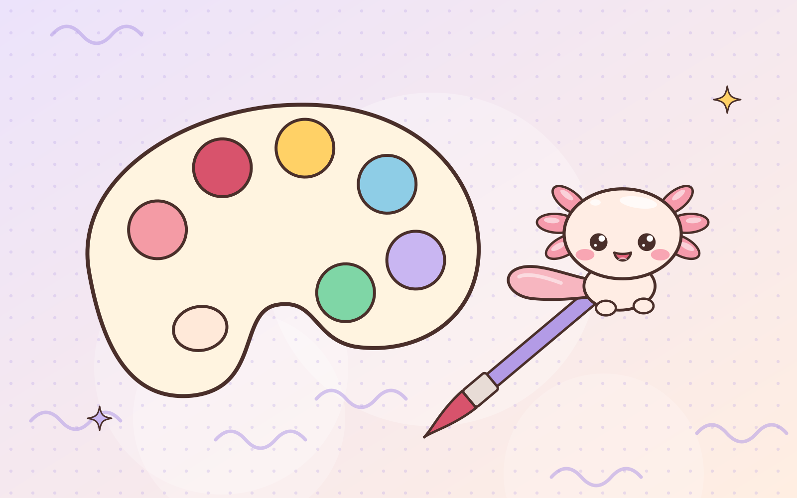
Ever noticed that everything in Pumiland shares the same “feel”, from stickers and comics to this website? The secret is a shared color palette.
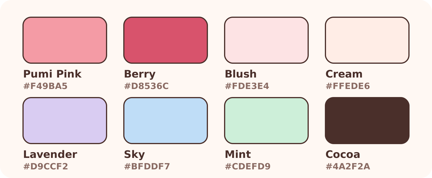
Main colors
- Pumi Pink
#F49BA5: the color of Pumi’s gills, the heart of it all. - Berry
#D8536C: a deeper pink for buttons and important things. - Blush
#FDE3E4and Cream#FFEDE6: warm, soft backgrounds.
Supporting colors
- Lavender
#D9CCF2, Sky#BFDDF7, and Mint#CDEFD9: the colors of Pumiland’s ponds and skies. Used for variety so not everything is pink.
Line color
- Cocoa
#4A2F2A: not black, but dark brown. Brown lines feel warmer and friendlier than pure black. Take a look at the lines in Pumi’s drawings!
Each friend has a color
Pumi’s friends have accent colors too: blue for Lumi, brick red for Kori, orange for Pipin, and leaf green for Cebi. These show up on each of their character pages.
Using this palette in your journal
- Pick one main color and two supporting colors.
- Use dark brown instead of black for headings.
- Leave plenty of cream space so the page feels airy.
You can use the color codes above in your favorite notes or drawing app. Happy experimenting! 🎨
 Have a suggestion or critique for Pumiland?